Furnishr
Project Timeline
2019 (3 months)
Skills
Branding, graphic design, wireframing, hi-fi mockups
About
Over a year and a half, I worked as the lead designer at Furnishr, a pre-seed startup. In this role, I spearheaded product and graphic design. I created a cohesive and modern design language and also implemented an end-to-end design process for future designers.
Background
Furnishr is an all-in-one solution when relocating homes. Customers have consultations with Furnishr’s inhouse interior designers to provide them with the desired look of their home and any additional requirements. Afterwards, Furnishr does the heavy lifting – designing the space, purchasing furniture, furniture assembly, and cleaning up.
Discovery
Project Goals
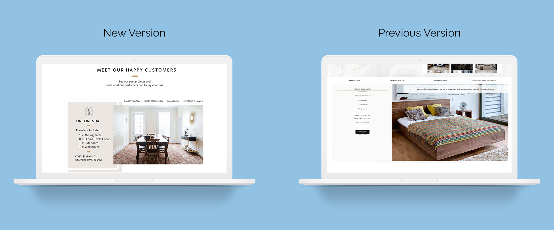
The goal of this project was to increase usability, understanding, and improve the overall aesthetic of the website. The business goal was to increase traffic and engagement, and decrease website drop-off rates.
Defining the Users
Furnishr’s target audience encompass both B2B and B2C customers. B2B customers include users who rent out their homes for profit like AirBnB Hosts and property / real estate investors. B2C customers are users who travel for work, such as expats and relocating workers.
Establishing Business Requirements
I conducted whiteboarding and card sorting workshops after gathering business requirements. These workshops allowed me to restructure the information architecture of the application and develop a new theme suitable for an interior design SaaS start-up.
Solution
My solution was three-fold:
- Create user-friendly content
- Based on user surveys and data collected from the application, I discovered that Furnishr’s services and pricing were not communicated effectively and therefore confused our users. Additionally, I implemented simple descriptive language to reduce friction at every touch point.
- I created a “quick quote” component to allow customers to have an expectation and gauge how much this service would potentially cost.
- Target businesses directly
- Given that B2B and B2C customers have different informative needs, it is essential to persuade distinct messaging in order to increase understanding of how Furnishr can work for the customer. It was found that the previous site was primarily targeting B2C customers, which excluded the needs of B2B users. Thus, adding a targeted page for businesses helped to guide customers towards the curated services offered.
- Establish a new style guide
- Furnishr’s design principles are innovative, clean, and simple. I elevated the designs by creating a theme around these design principles.

Conclusion
Dealing with large changes in a company's website requires deeper UX explorations to understand customer pain points when visiting the site, and moderated user testing to validate our designs before implementation. Ultimately, this is just one version of the website. Moving forward, multiple enhancements and user tests are necessary to ensure success.