01 — Context
One booking engine, hundreds of different businesses
Agilysys's spa and wellness platform has an online booking engine, where guests browse a property's offerings, pick a time, and book. It is embedded in the websites of hundreds of properties, from resort spas to hotel wellness centres to activity-led retreats.
No two of those properties look the same. Each has its own offerings, guest types, pricing rules, and brand. That is the real design brief: the booking engine can't be designed for one ideal property. It has to be adaptable enough to work for all of them.
It also has to work on the device guests actually use. Roughly 70% of guests book on a phone, so mobile is the primary experience.
02 — Problem
A foundation that couldn't keep up with the product
As the platform gained functionality, the original booking engine became harder to extend, and the problems showed up for guests and for the clients who relied on it.
Hard to scale
Every new capability (packages, add-ons, activities, member pricing) had to be squeezed into a structure that was never designed for it.
Drop-off in the flow
Guests were abandoning bookings before completing them, and the friction in the flow was a major reason.
Dated, inconsistent UI
Screens had accumulated one-off patterns over time, which made the experience feel dated and made every change slower and riskier.
Weakest where most guests are
Roughly 70% of users book on mobile, yet mobile was the weakest part of the product: a desktop layout squeezed onto a small screen. Fixing it was the priority, and it called for a mobile-first approach.
03 — Research
Listening to the people who run the properties
Because the booking engine has to serve so many different businesses, I started with the businesses. I spoke with a wide range of clients about what they wanted, where they struggled, and what look and feel they were aiming for. I paired that with a competitor review and prototype testing.
Client conversations
Pain points, goals, and brand vibe
What clients struggle with in the current flow, what their guests ask for, and the look and feel each property is trying to achieve.
Stakeholder interviews
Operations and internal teams
How offerings, pricing, and guest rules are actually configured day to day, and where the product fell short.
Competitor audit
How other booking engines cope
A review of how comparable booking experiences handle multiple guests, availability, and customisation.
Prototype testing
Validating the flow early
Testing prototypes of the redesigned flow to pressure-test the booking logic before it was locked in.
Four requirements came out of this work and drove every decision after: the design had to be adaptable per property, booking for more than one guest had to feel natural, availability had to account for the whole visit rather than a single service at a time, and, because most guests book on a phone, the experience had to be mobile-first.
04 — Starting point
A flow built for one guest on one big screen
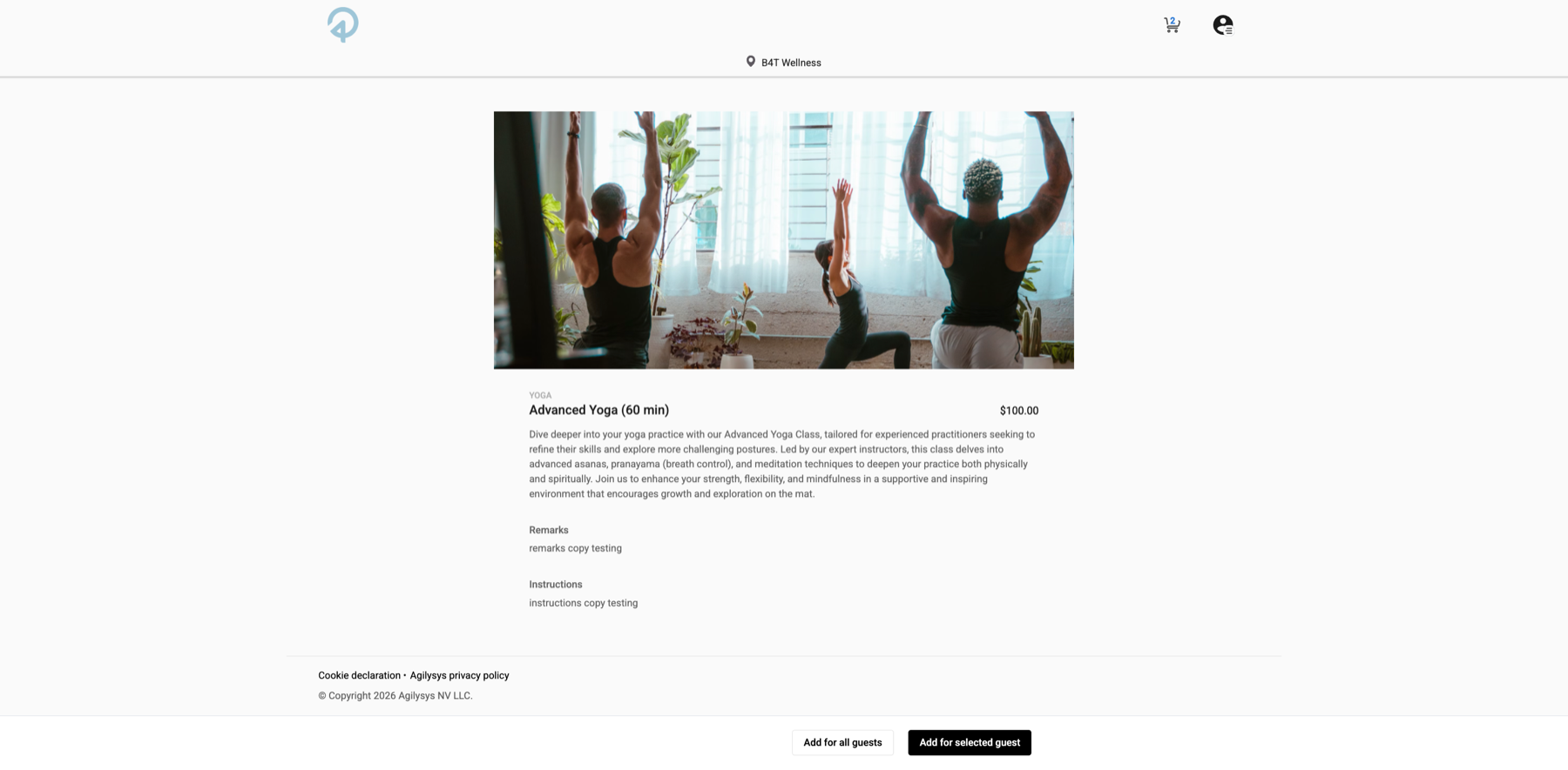
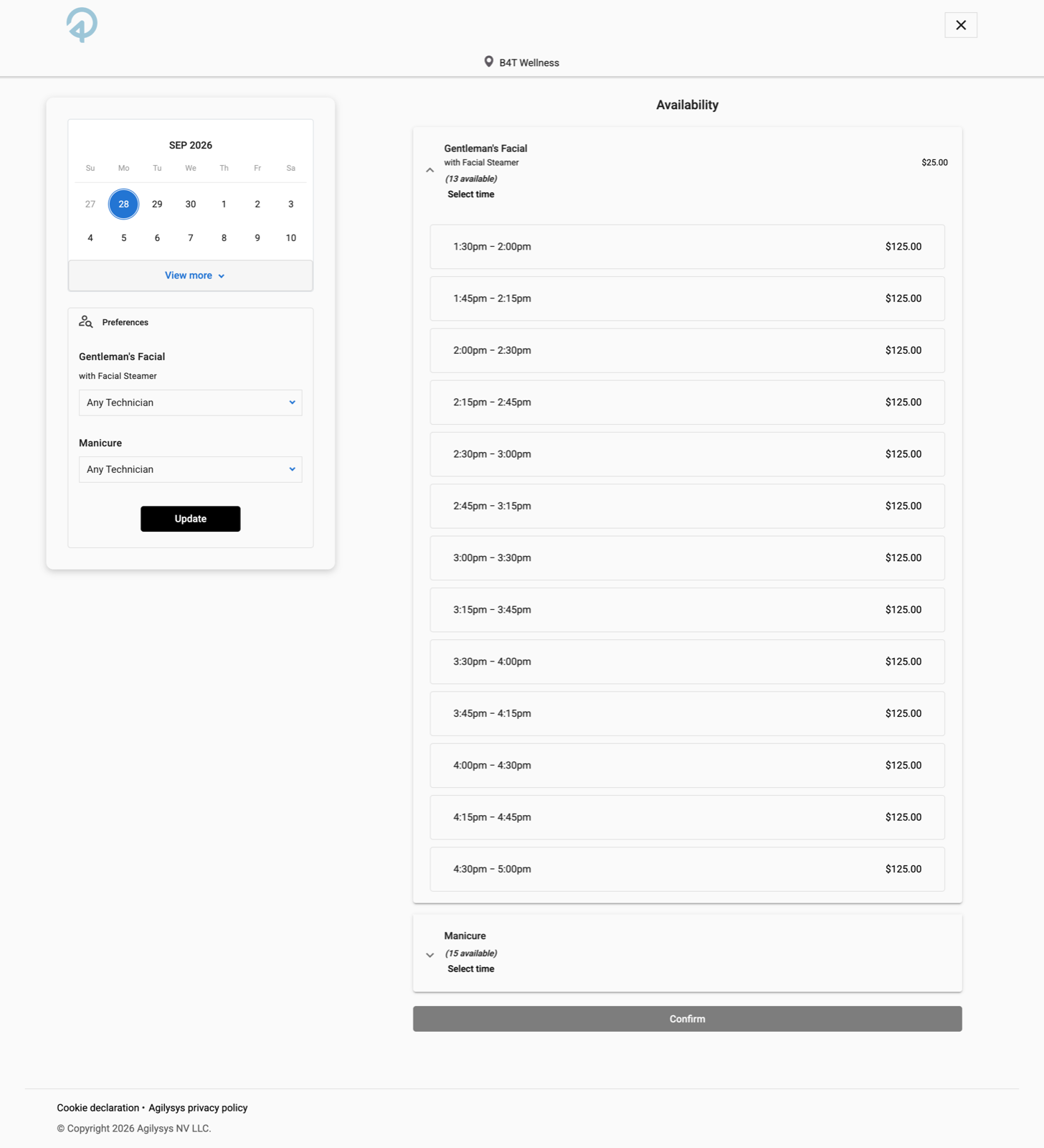
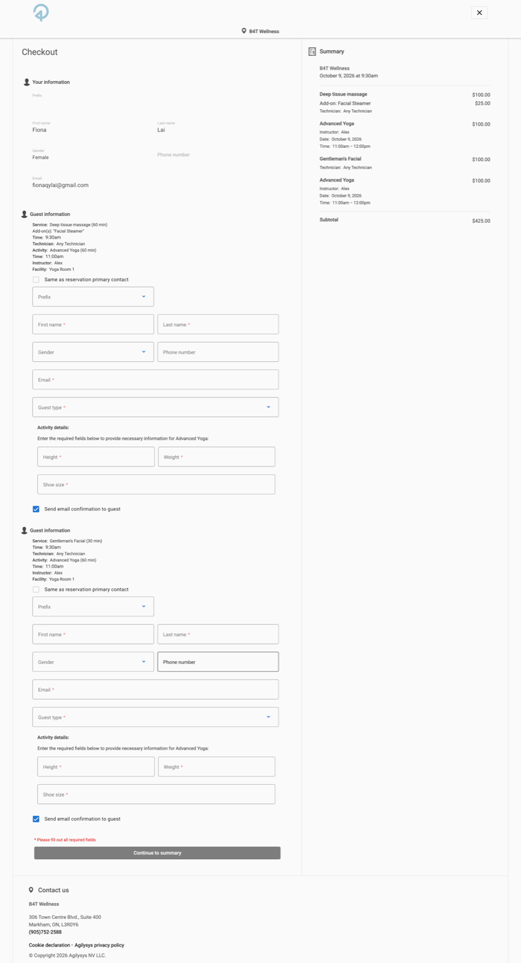
Before redesigning, I walked the existing flow end to end. It had been built around a single guest on a desktop, and every extra guest, service, or smaller screen exposed that. Client branding is removed below; the screens show a generic demo property.
05 — Key decisions
Four decisions that shaped the redesign
All four come from the same idea: keep the structure consistent and let each property change the surface. Each one is tied to the problem it answers.
Final designs adjusted per NDA. Contact fionaqylai@gmail.com for the full case study.
1. A base theme every property can make their own
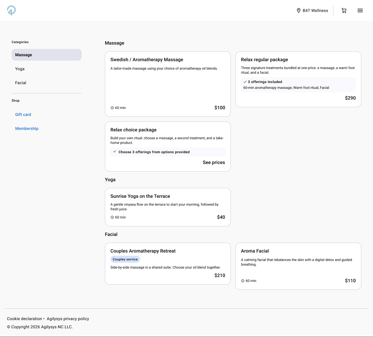
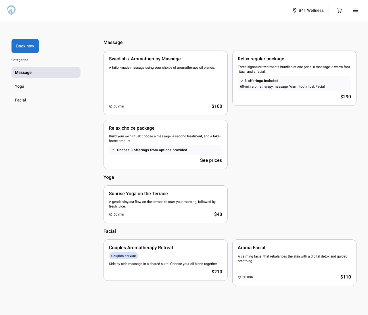
Rather than design one look, I designed a strong, neutral base theme that works out of the box, plus a system around it that lets each client choose their own typography, colours, and imagery. The hard part was deciding where to draw the line: too much freedom and every property becomes a one-off to support; too little and it stops feeling like theirs.
Fixed for every property
Structure, spacing, interaction patterns, and booking logic. This keeps the experience reliable for guests and maintainable for the team.
Chosen by each property
Typography, colours, imagery, and how guests enter the flow, from the full menu to a "Book now" entry point. This is how each property expresses its brand.
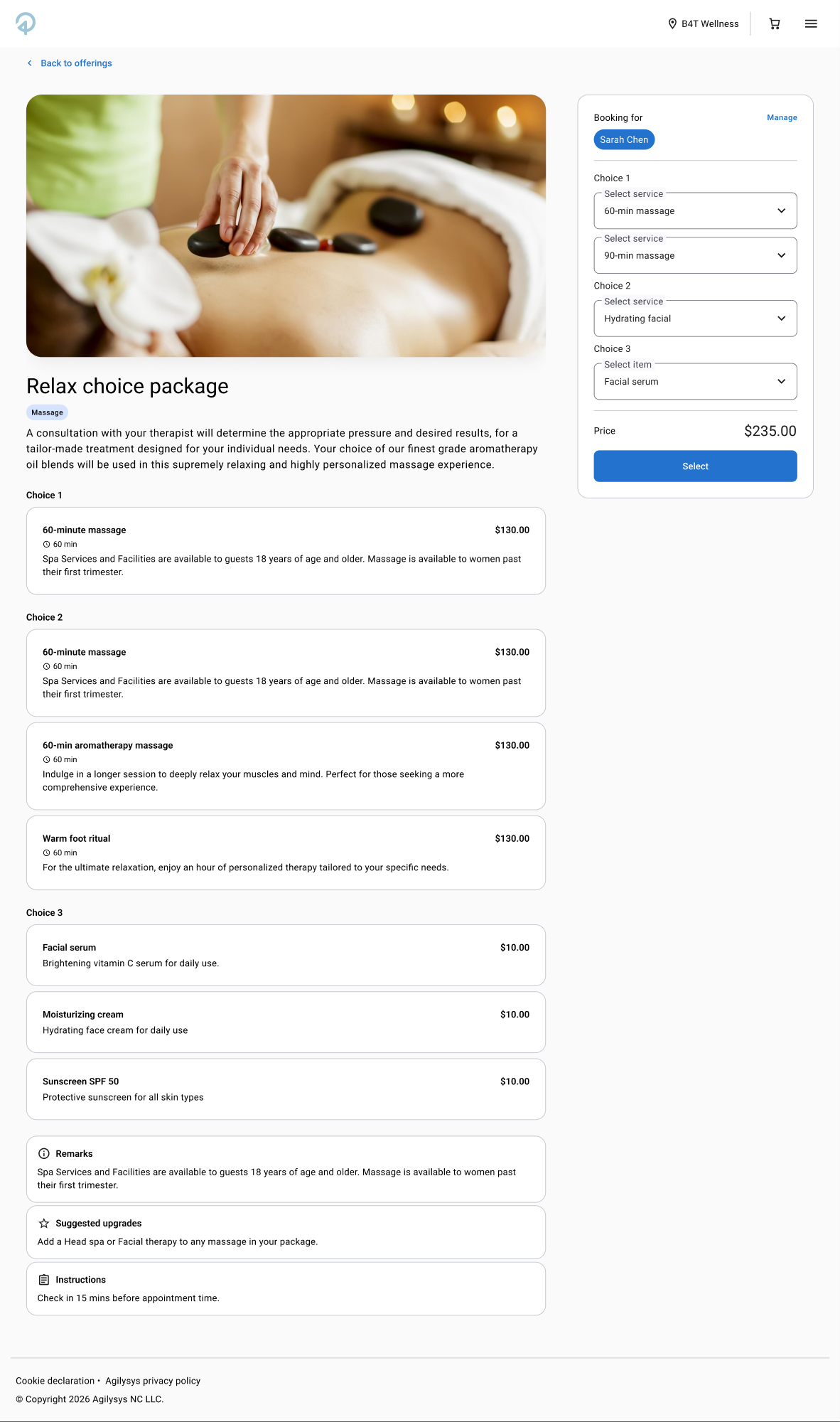
The same thinking applied to content. Offerings come in different shapes: single services, regular packages, choice packages ("choose 3 offerings from options provided"), couples services, add-ons, and member pricing. I designed a small set of flexible offering templates that adapt to what a property sells, instead of a layout per case.
2. Multi-guest booking that doesn't multiply the work
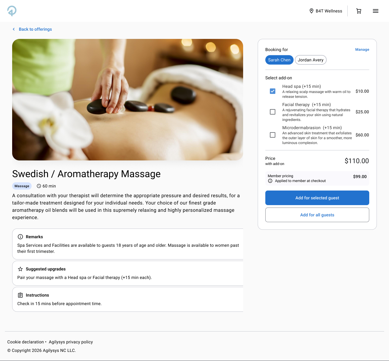
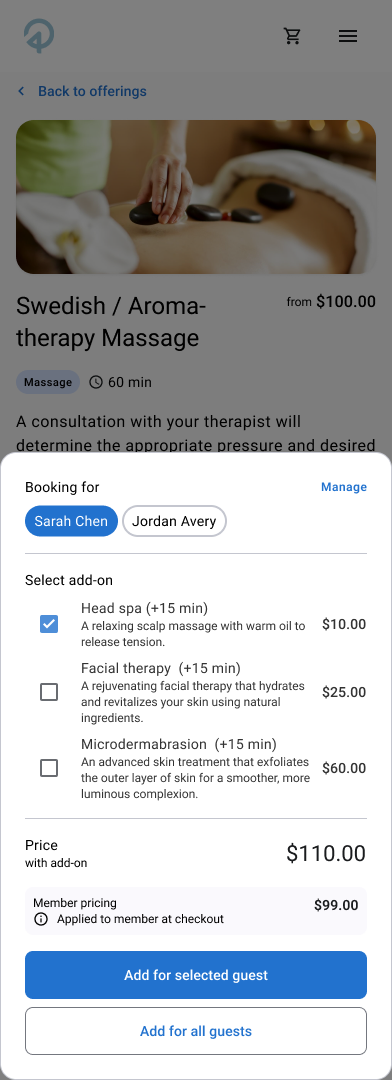
Groups, couples, and families book together, and the old flow treated each additional guest as a separate chore. The redesign puts the guest at the centre: a "Booking for" switcher on every offering, add-ons chosen per person, and a choice between adding for the selected guest or for all guests. Member pricing is shown up front and applied at checkout.
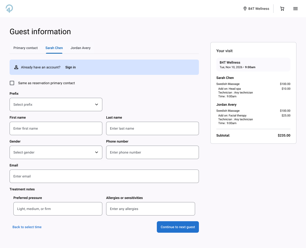
Guest information follows the same logic. Each guest gets their own tab, a "Same as reservation primary contact" shortcut, and a sign-in prompt for returning guests, so the booker only types what's new. A running "Your visit" summary keeps every guest's services and price in view.
3. Smart availability that plans the whole visit
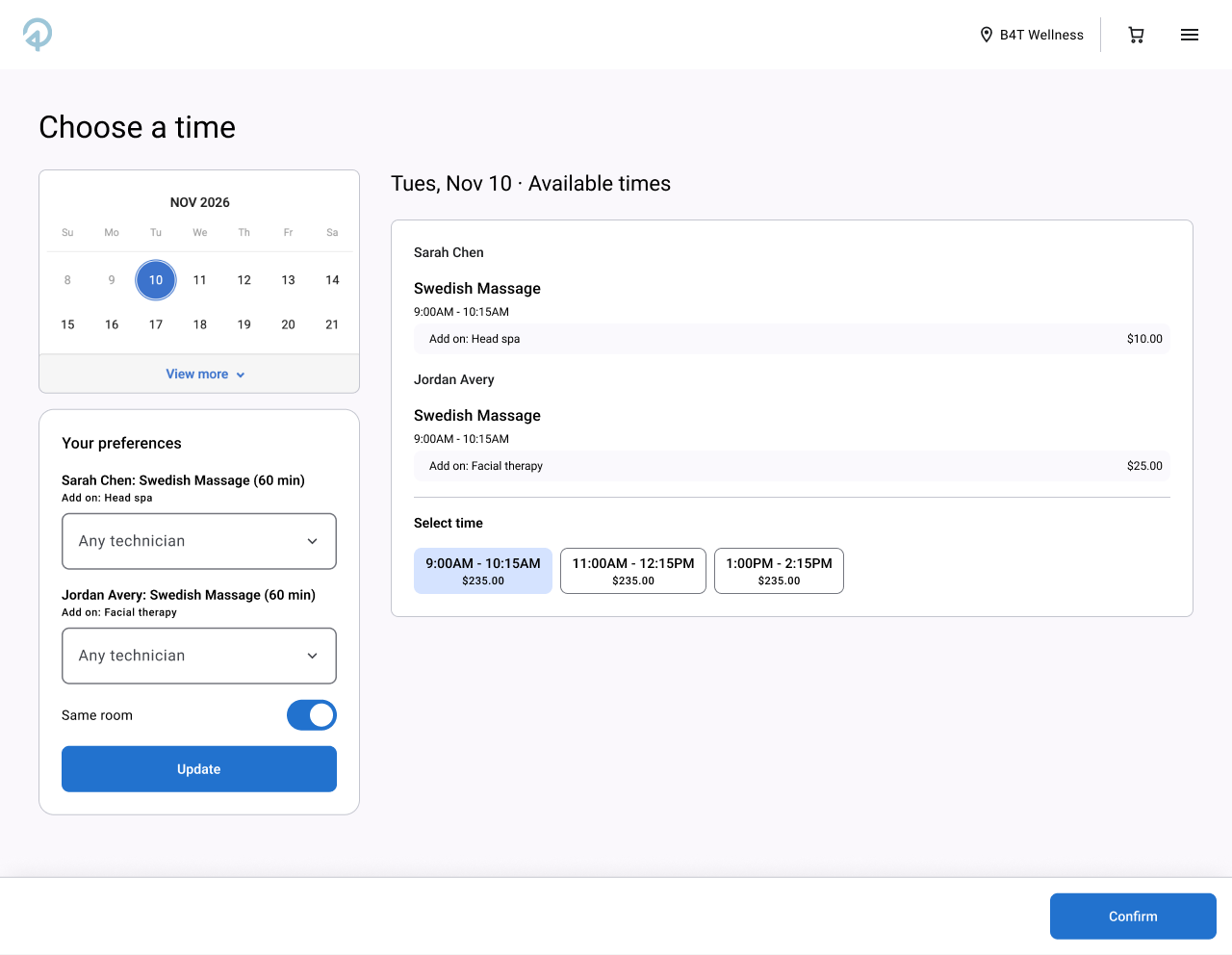
Guests think about their whole visit, not one service at a time. Availability now reflects the full itinerary: one view that shows every guest's services and add-ons, technician preferences up front, and a "same room" option for couples and groups. Times are priced as a whole, so guests aren't discovering conflicts after they've chosen. The result is fewer dead ends between picking an offering and confirming a time.
4. Mobile-first, because most guests are on a phone
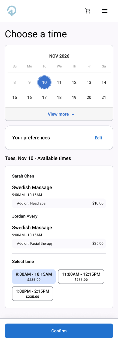
With most guests booking on mobile, I stopped treating the phone as a smaller desktop and designed for it first. Every flow starts as a single column built for thumbs: sticky actions anchored to the bottom of the screen, a bottom sheet for booking options and the running summary, and a collapsed "Your preferences" panel that expands only when guests need it. The desktop layouts then add space and side-by-side panels, rather than changing the structure, so guests get the same flow on any screen, and the mobile experience is no longer the weakest link.
06 — Completing the booking
Carrying every guest through to confirmation
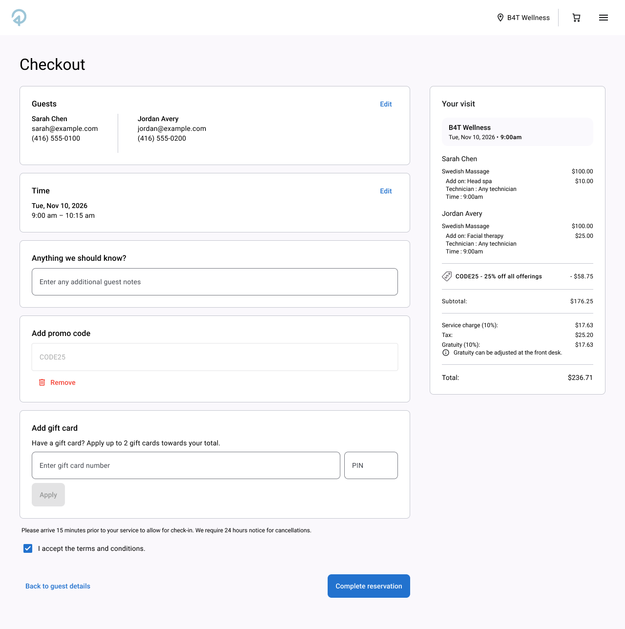
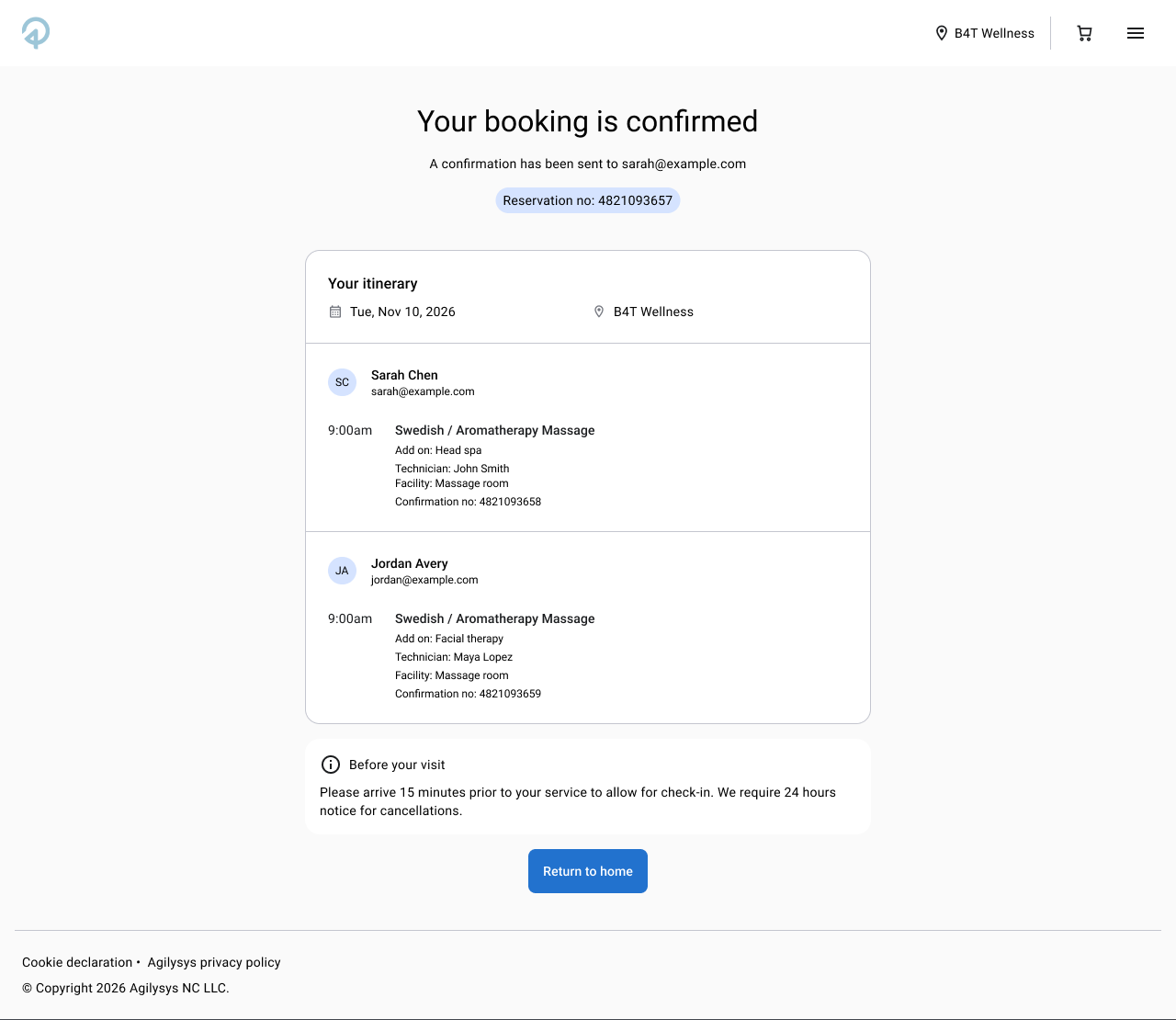
Checkout lists the guests, the time, and an itemised visit per guest, with promo codes and gift cards applied in context and edit links back to earlier steps. The confirmation page then breaks the itinerary down by guest, with a reservation number and the details they need before arriving.
07 — Outcomes
From a brittle flow to a foundation built to scale
The redesign has shipped. It's too early for reliable post-launch numbers, so here is what changed against each problem I set out to solve.
- Hard to scale → one adaptable foundation serving hundreds of properties, with a consistent component base that makes new functionality faster and safer to add.
- Drop-off in the flow → multi-guest booking handled natively instead of as repeated single-guest flows, and availability that accounts for the whole visit, catching conflicts before guests commit.
- Dated, inconsistent UI → a neutral, modern base theme, with typography, colour, and imagery controlled by each client.
- Weakest where most guests are → a mobile-first experience for the guests who book on a phone, replacing the weakest part of the old product.
I'll judge it by measures tied to those problems: booking completion through the flow, completion on mobile specifically, and how quickly a new property can be themed and launched.
08 — Reflection
Designing the rules, not just the screens
Designing for hundreds of properties meant I couldn't pick the right answer for one business. I had to define a system of defaults, constraints, and flexible parts that gives every property a good answer. That shifted a lot of my time from pixels to decisions about what should be configurable and what should stay fixed.
Talking to clients early made the biggest difference. Hearing how differently they run their properties, and what look they wanted, is what convinced me that adaptability had to be the foundation of the design rather than an add-on at the end.